


Simon Jenner
Thursday 16 November 2023
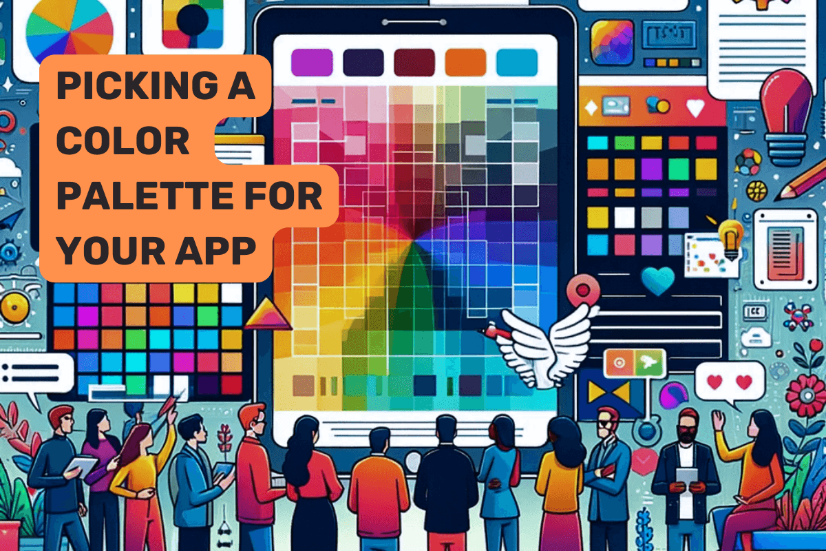
Choosing the right color scheme for a mobile or web app design is crucial as it impacts user experience, brand perception, and overall usability
Posted in:
Startups
Choosing the right color scheme for a mobile or web app design is crucial as it impacts user experience, brand perception, and overall usability. Here's a comprehensive guide to help startup founders with this process:
Understanding Color Psychology
Research Color Meanings: Different colors evoke different emotions. For example, blue often represents trust and stability, while green is associated with growth and health.
Target Audience: Consider the demographics of your user base, as color preferences can vary across age, gender, and cultural backgrounds.
Analyzing Competitors
Competitive Analysis: Look at the color schemes used by competitors. This can offer insights into industry standards and help in differentiating your app.
Brand Consistency: Ensure your colors align with your brand's existing color palette if you have one.
Design Considerations
Contrast and Accessibility: High contrast between elements ensures readability and accessibility. Tools like WebAIM's Contrast Checker can be helpful.
Color Harmony: Use color theory to create a harmonious palette. Tools like Adobe Color can help in creating color schemes based on analogous, complementary, or triadic color harmonies.
Minimalism: A minimal color palette can often be more effective and aesthetically pleasing, avoiding overstimulation.
Technical Aspects
Platform Guidelines: Familiarize yourself with the design guidelines of iOS and Android, as they offer specific recommendations for color usage.
Testing on Devices: Colors can appear differently on various screens, so test your color scheme on multiple devices.
User Testing and Feedback
A/B Testing: Implement A/B testing with different color schemes to see which performs better in terms of user engagement and conversion.
User Feedback: Gather feedback from your target audience about the color scheme to make informed decisions.
Tools and Resources
Adobe Color: For creating color schemes.
Coolors.co: Another tool for generating color palettes.
Material Palette: Specifically useful for Android app designs.
WebAIM Contrast Checker: For checking the accessibility of your color scheme.
Color Hunt: Offers a selection of trendy and popular color palettes.
References and Further Reading
"Interaction of Color" by Josef Albers: A fundamental text on color theory.
"Don't Make Me Think" by Steve Krug: Offers insights on web usability, including color usage.
Nielsen Norman Group Articles: Offers a wealth of information on user interface design and color psychology.
Conclusion
The choice of colors for your app should be a balance of aesthetic appeal, usability, and brand identity. It's an iterative process that involves research, testing, and refinement. Utilizing the tools and principles outlined above, startup founders can develop a color scheme that resonates with their audience and enhances the overall user experience of their app.
Ready to launch your startup idea with an MVP?
Download our step by step guide for non-technical founders to create a startup Minimum Viable Product (MVP)
Get the eBook